
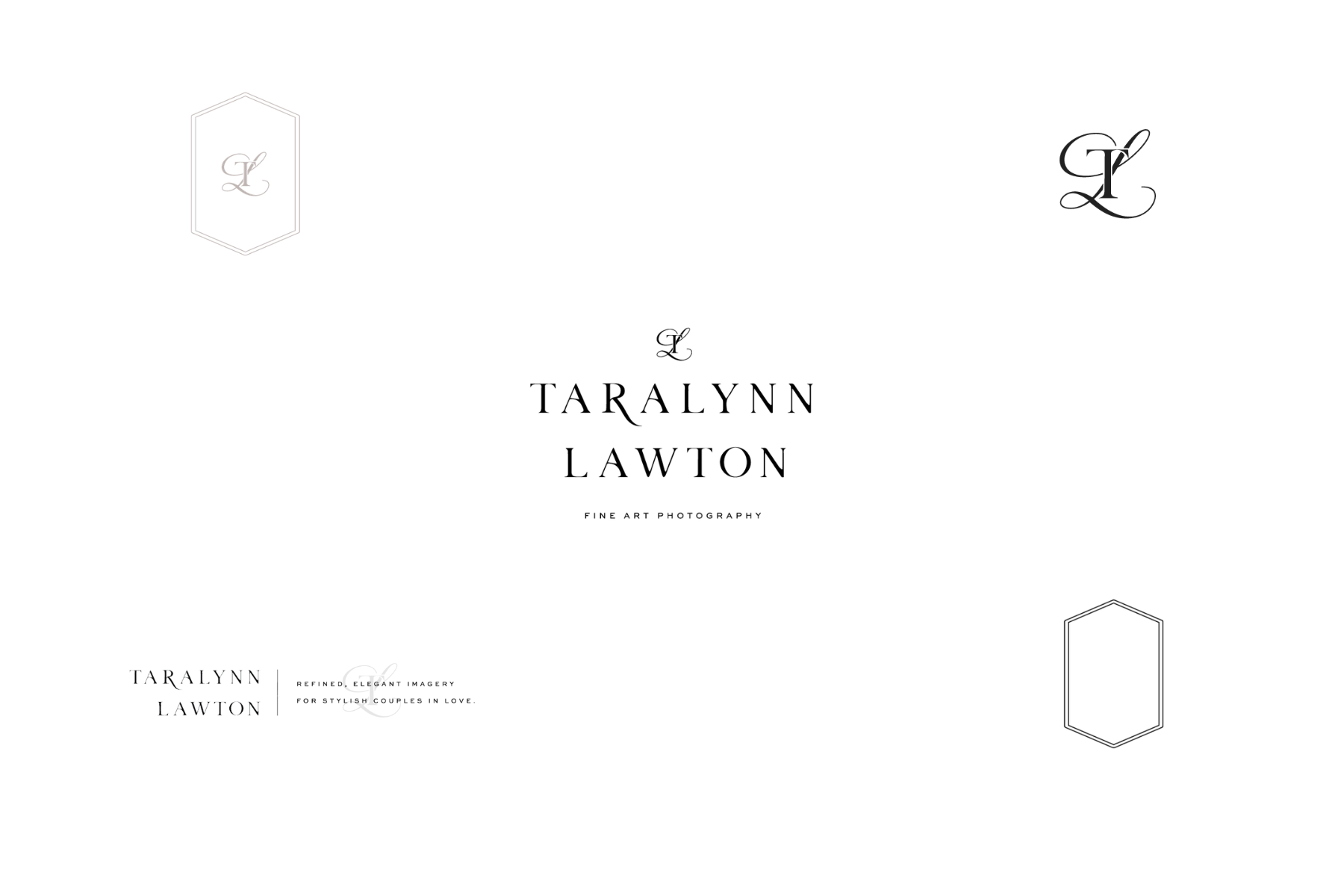
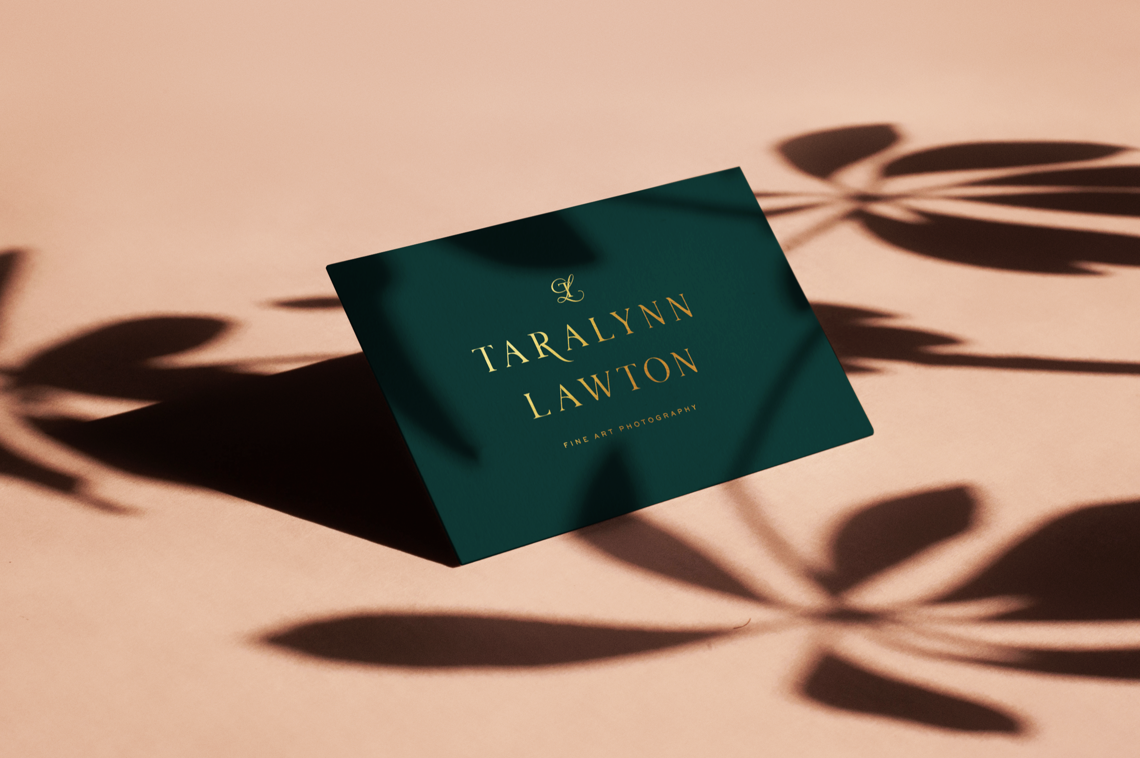
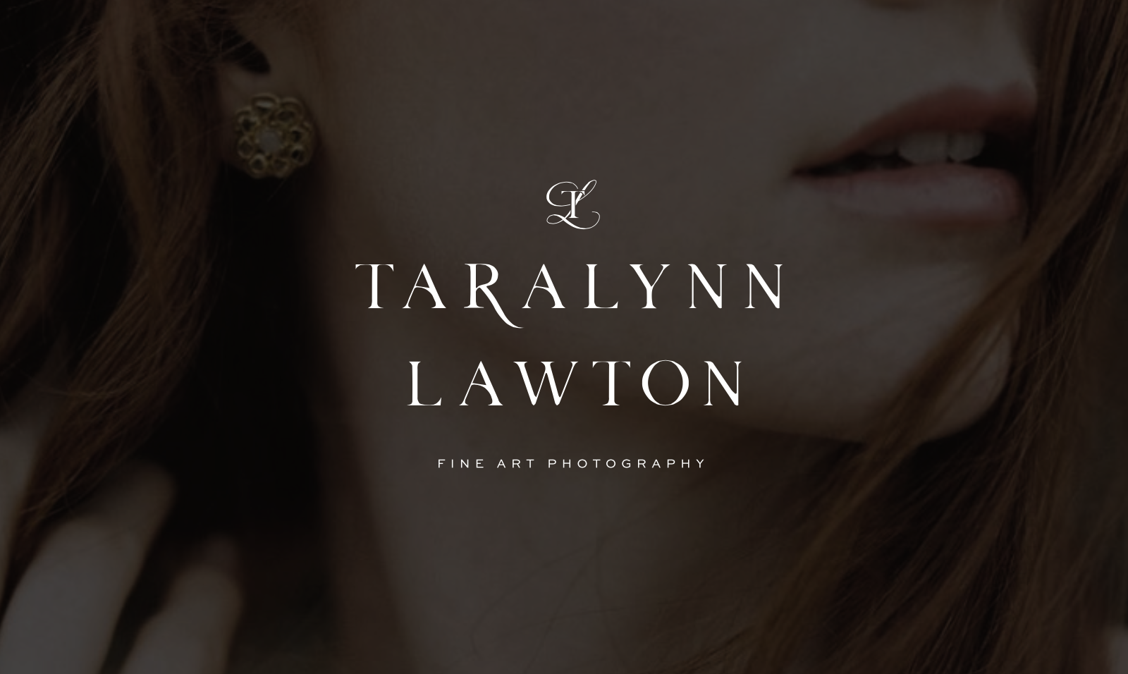
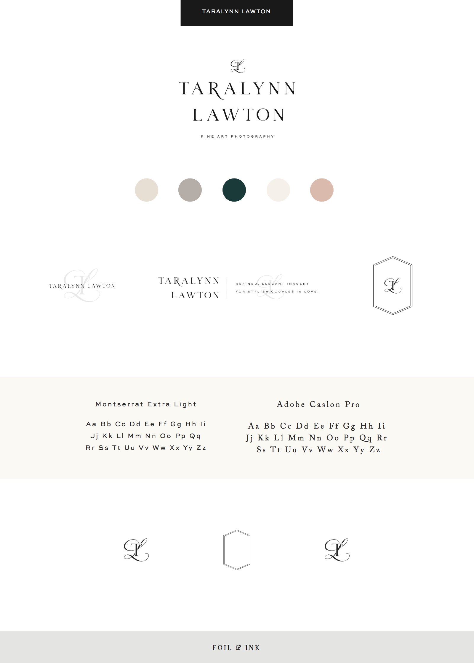
Taralynn Lawton contacted us about doing a custom re-brand. She wanted a minimal look with pastel colors.
About Taralynn Lawton
Taralynn Lawton is a photographer who focuses on elegant and romantic wedding photography for the modern couple.
3 words that describe your style
- Elegant – I want my brand to be luxurious and graceful, and to attract clients with refined taste in style and design.
- Modern – Both in my personal taste and photographic style, I’m drawn towards sleek, fresh, minimal, contemporary imagery and design, and want to avoid showcasing anything vintage or boho.
- Romantic – Because I’m a hopeless romantic! My style of shooting has lots of kissing, dipping, dancing, and hand holding. I love capturing a couple’s passion for each other and also the subtle gestures and glances of two people in love.
Why should clients trust you over other competitors?
Unlike a lot of other photographers out there, I was professionally trained and have a Bachelor’s of Science in Photography. I’ve been studying it since I was 16. I have years of experience and education to draw from. I truly think this is how I’ve developed such a strong attention to detail and commitment to consistency that I often see lacking in my competition. I’m meticulous in my shooting and editing process, striving for every image to be and exquisite and meaningful addition to my client’s love story.
What are the core values in your business?
- Capturing memories to treasure for a lifetime – I not only want to create beautiful imagery for my couples, but also preserve memories and keepsakes for generations to come.
- Making my clients feel beautiful – I want them to have a luxurious experience and feel like the most beautiful and important people in the world on their wedding day.
- Shooting on film – In addition to the incredible detail, tonal range, and dreamy color palette of film, it’s an important aspect of my style and business because it forces me to slow down and think critically about the lighting and composition of every frame. It requires an intentionality and attention to detail that I strive for in my work.
What made you choose to work with Foil & Ink over other designers?
I initially fell love with Foil & Ink after seeing her work on Charity Maurer’s website! I loved how clean and consistent the site was and it excused refined elegance which is what I was envisioning for my rebrand. I casually looked at a few other designers but I was always drawn to Foil & Ink’s muted color palette, subtle textures, and overall cohesiveness of their aesthetic! Exactly what I wanted!
What are 3 benefits as a result of working with Foil & Ink?
- Taking the time to really dive into thinking about my brand, aesthetic, and ideal client.
- Spending less time thinking or worrying about what fonts and colors I should use since those are now set up for me!
- I have yet to officially launch the new brand or incorporate it into my website yet, but I’m sure once I do I will have the benefit of having a really professional, thoughtful, and cohesive brand that will attract the clientele I’m seeking.

![]()
Loving this design? You can request custom work HERE. Follow us on Instagram to see more of our work!
